Understanding the Core Functionality: The Essence of a Toggle Switch
In the expansive landscape of graphical user interfaces (GUIs), designers often face a critical decision: when to employ a toggle switch versus a traditional checkbox. While both elements deal with binary states, their fundamental mechanics and implied user interactions are distinct. Understanding these nuances is paramount for crafting intuitive and efficient user experiences.
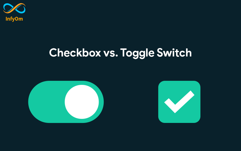
A toggle switch is a sophisticated GUI component engineered for immediate action. It allows users to alternate between two mutually exclusive states, typically "on" and "off" or "true" and "false," through a visual mechanism that mimics a physical switch. Think of a light switch: you flip it, and the light comes on or goes off instantly. This real-world analogy is crucial, as digital toggle switches provide immediate visual feedback and activate their corresponding function upon interaction, requiring no additional confirmation steps.
The visual representation of a toggle often involves a sliding thumb along a track, which changes appearance – color, position, or both – to clearly indicate the selected state. This design choice, prevalent across major design systems like Apple's Human Interface Guidelines and Google's Material Design, emphasizes clarity and accessibility. These guidelines stress avoiding sole reliance on color for state indication, ensuring robust solutions for color-blind users, and incorporating clear labels or contextual elements to explain the switch's function. For a deeper dive into these specifics, refer to our article: Toggle Switch Explained: GUI Functionality & Design Principles.
The primary purpose of a toggle is to facilitate quick adjustments of binary settings or features that require frequent state changes. Imagine turning Wi-Fi on or off, enabling dark mode, or showing/hiding a password field. These are actions where the user expects an instant impact on the interface or system functionality. The inherent immediacy of a toggle switch minimizes cognitive load, making it the preferred choice for independent on/off controls in settings menus or options that directly affect content visibility or interaction within the current view.
The Role of Checkboxes: Independent Choices and Grouped Selections
In contrast to the immediate activation of a toggle, checkboxes serve a different, equally vital purpose within user interfaces. A checkbox is a GUI element, typically a small square, that allows users to select one or more options from a list. When an option is selected, a checkmark usually appears inside the square. Unlike the instantaneous effect of a toggle, checkbox selections often require a subsequent action, such as clicking a "Save," "Submit," or "Apply" button, for the changes to take effect.
The defining characteristic of checkboxes is their capacity for multiple, independent selections. This makes them ideal for scenarios where users need to choose several items from a group without affecting other choices. Consider selecting multiple files for deletion, subscribing to several newsletters, or choosing ingredients for a recipe. Each checkbox represents an independent option, and checking one does not automatically uncheck another (unless explicitly programmed to do so, which usually then warrants radio buttons).
Beyond multiple selections, checkboxes are also used for singular, independent choices, particularly when those choices are part of a larger form submission. A classic example is "I agree to the Terms and Conditions," where checking the box is a prerequisite for proceeding but doesn't instantly change the UI state; it merely enables the next action. They are also useful for optional settings that don't need immediate feedback, such as "Remember me" on a login page, where the effect is felt upon the next login.
While a toggle switch mimics a physical switch for immediate action, a checkbox is more akin to marking an item on a list. This distinction is crucial when deciding which element best communicates the expected interaction to the user. Design systems also recognize checkboxes for hierarchical options, such as parent-child dependencies often seen in macOS, where selecting a parent checkbox might offer a "mixed state" if only some child options are selected.
The Deciding Factor: When to Use a Toggle vs. a Checkbox
The core principle guiding the choice between a toggle switch and a checkbox boils down to user expectation regarding immediacy and action scope. Misusing these elements can lead to confusion, frustration, and a diminished user experience. To make the correct decision, ask yourself: "Does this action take effect immediately, or does it require confirmation?"
Immediate Action vs. Confirmation
- Use a Toggle Switch When:
- The setting's change takes effect instantly without requiring a separate "Save" or "Submit" button.
- The user is switching between two mutually exclusive states (e.g., "on" and "off") that directly impact the current view or functionality.
- The action is frequent and needs to be quick, like enabling/disabling Wi-Fi, Bluetooth, or "Do Not Disturb" mode.
- The state change is clear, visible, and impacts an independent setting.
- Examples: "Enable Notifications," "Show Password," "Dark Mode," "Location Services." For more in-depth guidance on designing these, see Mastering Toggle Switches: Your Guide to Intuitive UI Design.
- Use a Checkbox When:
- The user needs to select one or more items from a list of independent options.
- The changes need to be confirmed by a separate action (e.g., clicking a "Save," "Apply," or "Submit" button) before they take effect.
- The user is accepting terms, subscribing to a newsletter, or making a selection that is part of a larger form.
- There might be hierarchical selections (e.g., selecting a parent category that then allows for mixed states if only some sub-items are checked).
- Examples: "I agree to the Terms & Conditions," "Select all items," "Receive marketing emails," "Remember me (for next login)."
Impact Scope and Context
Consider the scope of the change. A toggle typically modifies a single, independent setting that has an immediate, localized impact. For instance, toggling a "Show Advanced Settings" switch instantly reveals or hides those options on the screen. Checkboxes, conversely, are often part of a collection, allowing users to aggregate selections before performing a collective action or submitting data. While a single checkbox can exist independently, its strength lies in its ability to facilitate multiple choices within a defined group.
Another lens is whether the element controls a feature or a datum. Toggles control features or states (e.g., "Feature X is On/Off"). Checkboxes select data points or confirm agreement (e.g., "Item Y is selected," "I agree to condition Z").
Common Pitfalls and How to Avoid Them
Despite their apparent simplicity, both toggle switches and checkboxes are frequently misused, leading to poor user experiences. Awareness of common pitfalls can significantly improve UI design.
- The "Toggle That Needs Saving" Trap: A cardinal sin of UI design is using a toggle switch for a setting that then requires a separate "Save" or "Apply" button to enact the change. This directly contradicts the user's expectation of immediacy. If the change isn't instant, use a checkbox within a form that has a clear submission action.
- Ambiguous Labeling: Neither element should rely solely on its visual state. Always provide clear, concise labels that explain the function. For a toggle, "Enable Notifications" is better than just a switch. For a checkbox, "I agree to terms" is clearer than an unlabeled box. Avoid double negatives (e.g., "Do not disable notifications").
- Sole Reliance on Color: Especially for toggle switches, relying only on color (e.g., green for "on," grey for "off") to indicate state is an accessibility barrier for users with color vision deficiencies. Incorporate position, icons, or text labels ("On"/"Off") to ensure clarity for everyone.
- Inconsistent Behavior: If your application uses toggles for immediate actions in one section, don't suddenly make them require confirmation in another. Consistency builds trust and reduces cognitive load. Similarly, don't make a checkbox behave like a toggle (i.e., activate instantly without a submit button).
- Insufficient Touch Targets: Particularly relevant for mobile interfaces, ensure both toggles and checkboxes have adequate touch target sizes to prevent accidental taps, as specified by design guidelines like Material Design.
- Hidden Impact: Users should always understand the consequence of their interaction. If a toggle or checkbox affects something not immediately visible, consider providing additional explanatory text or visual cues.
Conclusion
The distinction between toggle switches and checkboxes is more than just a stylistic choice; it's a fundamental decision impacting user interaction and comprehension. Toggle switches excel in scenarios demanding immediate, independent action, mirroring the physical world's direct cause-and-effect. Checkboxes, on the other hand, are the champions of independent selections, multiple choices, and actions that are part of a larger workflow or require explicit confirmation.
By thoughtfully applying these principles – prioritizing immediacy for toggles and deferred action for checkboxes – designers can create interfaces that are not only aesthetically pleasing but also profoundly intuitive, efficient, and accessible. Choosing the right UI element for the right context is a hallmark of superior user experience design, guiding users seamlessly through their digital journey and preventing unnecessary confusion.